
As a startup or small business, design has to be at the center of your app development process. But effective design means more than just arranging elements correctly; you have to think about how colors interact with each other and represent ideas. This is color theory. Using color theory to build better apps is key.
Color theory is an incredibly powerful tool for startups and entrepreneurs that can help transform their apps. An understanding of color theory can be the difference between an unappealing mess and a visually stimulating tool that maximizes engagement.
In this blog post, we’re going to delve into color theory so that you can use it to build better apps and reach your target audience more effectively.
The Basics of Color Theory
Color theory can be used to create more readable, attractive, and engaging user interfaces in app design. You want to pick the right color scheme, or combination of colors for your app, but how do you know which ones to pick?
After all, there are endless color combinations out there. This is where color theory comes in.
Color theory is a discipline that explores how using different combinations of hues, tints, tones and shades create contrast, hierarchy and unity. This is true for applications and across all of the arts.
Color theory includes using primary, secondary, and tertiary colors; tinting and shading those colors; using tonal ranges; using analogous, complementary, split-complementary, monochromatic, and triadic palettes.
It includes using scientific formulas for measuring brightness; playing with texture, pattern and contrast; understanding how hue impacts user experience; and using accessible or Web Content Accessibility Guidelines (WCAG) approved color combinations.
I bet you didn’t know there was so much science behind color! However, this is incredibly important because color can have profound impacts on how people feel toward and relate to an app, film, house, or painting.
Remember, many people are incredibly visual in how they learn, relate to the world around them, and retain information. This is why using color theory to build better apps is so important!
Understanding Color Types is Key to Using Color Theory to Build Better Apps
Like any specialized field, color theory comes with its own jargon, terms, and specific language. We have thrown a lot of different terms at you, but what do they actually mean? And how can you truly approach using color theory to build better apps?
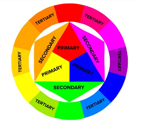
While color theory can get highly specific and there are many approaches, it all is based on having an understanding of the three basic color types. These are:
- Primary Colors
- Secondary Colors
- Tertiary Colors
Primary Colors
Primary colors are the foundation for using color theory to build better apps. Primary colors include red, yellow, and blue. Using any combination of these three foundational hues can help developers create more effective visuals.
With primary colors, designers have access to a wide array of shades and tints that stretch beyond the traditional each hue contains which makes using them a powerful tool when it comes to creating striking visuals.
Understanding how to use primary colors – the importance of contrast, how they interact with one another – is key to using them effectively and building great user experiences.
Secondary Colors
Understanding color theory – and in particular secondary colors – is key to creating more impactful apps.
Secondary colors are combinations of two primary colors, either two adjacent colors on the color wheel or a combination of one primary color with a secondary color.
For example, mixing red and yellow yields an orange hue, while red and blue create a vivid purple.
Tertiary Colors
Developing visually appealing apps using color theory can be a creative challenge. Understand the basics of color mixing and the theory of tertiary colors can help.
Tertiary colors are created when two primary colors are combined with a single secondary color, forming a mix of three hues in one single tone.
At first, this may appear intimidating, but using tertiary colors strategically can generate more depth and expressiveness than using only primary or secondary colors alone could ever provide.
How to Actually Approach Using Color Theory To Build Better Apps
Keep in mind, that there are many approaches to color theory and this blog post is only a simple primer meant to introduce a few of the concepts as they can be applied to app design.
Of course, if this interests you, you can go much deeper into the topic. Here is a great resource!
One of the most important things you can do when it comes to applying color theory to apps is to keep it simple. Simple color schemes not only make things easier for you but are also shown to improve the user experience.
What do we mean by simple?
How to Create A Simple Color Scheme
A University of Toronto study on how people used Adobe Color CC revealed that most people preferred simple color combinations that relied on only two to three colors.
But, how do you pick the right color scheme? This is where the color wheel comes in handy. Here are a few standard color scheme standards that can help you make that decision more easily.
- Monochromatic: This means that all of the colors in a color scheme have the same base color. For example, all of the colors are based on blue or pink. This can create a more unified and soothing effect.
- Analogous: This is when related colors are used to create a scheme. For example, one of the most famous logos and branded color schemes on earth is that of McDonald’s. They use red and yellow. This is an analogous color scheme that uses primary colors.
- Complementary: These color schemes involve colors that sit opposite each other on the color wheel. They contrast strongly and can be used to grab the attention of users. The most often used primary color combinations are red and green; yellow and purple; and orange and blue.
One of the most used social media apps in the world, Whatsapp, is an excellent example of how to use complementary colors to give your app more impact. On mobile, their icon is green and white, and the notification that pops up with the number of messages is mostly red.

How to Create Your Own Custom Color Scheme
As we have already said, there are many approaches to color theory and many ways to think about color. Creating your own custom color scheme is not as difficult as many people think!
For example, you could think of the culture of the people in your target audience. What sorts of colors appeal to them? People in different countries, cities, and at different ages may generally prefer different color schemes.
Is a certain color or color scheme particularly trendy right now? Depending on your type of app you may want to incorporate this color scheme, or avoid it entirely.
One popular and incredibly timeless color scheme is to choose a palette of neutral colors with a bold pop. For example, this could be grey, white, and bright blue. It could be black, cream, and neon pink.
These color schemes tend to have enough to keep the eye interested with a single bold color, while feeling coherent enough due to their neutral base.
Whatever you choose, it is key to stick to only a few colors. Especially if your app contains a lot of text, it is critical that the colors you choose enable your users to read it.
Usability, Accessibility, and Color
One of the most important aspects of color theory when it comes to creating a usable app is contrast. According to Adobe:
Color contrast is a term used in color theory that describes the difference between different color hues. Tonal contrast — a different type of contrast adjustment — describes the difference between the lightest and darkest tones in the image. Both types of contrast are needed for a balanced image and knowing how to adjust each during the editing process is very important for the overall photo quality.
While designers often favor low contrast based purely on aesthetics, if there is too low color contrast on your app, no one will be able to read the text or choose the right elements.
When it comes to apps especially, it is critical to think of how and where your app will be used. This could be on a small mobile device in bright daylight, for example. If the colors of your app are too similar or too low value, no one will be able to understand any of the elements.
Also, it is important to design for accessibility. This is especially true when it comes to color.
Approximately 8% of men and 0.5% of women in the US are affected by some form of color blindness. Red and green colors are a common problematic combination. This means that potential users cannot tell the difference between these colors.
Also, in general, research shows that many women are able to perceive more complexity and nuance in color than men. Keep in mind that vision loss is also a part of the natural aging process for many people as well.
This is why it’s critical that your app does not rely purely on color to guide users to actions. While you want to use color in a pleasing way for the majority without colorblindness, your app should not rely on color for critical functions.
A good example of this is the WhatsApp icon above. While the red and green create a visual pop, colorblind people will still know exactly how many new unread messages they have on the app.
Final Thoughts on the Art of Using Color Theory to Build Better Apps
Color theory is a critical tool for every user interface designer, whether you’re building an app or a website.
By understanding the basics of color – primary, secondary, and tertiary colors – and how to use them effectively, you can create beautiful, cohesive designs that users will love. And when it comes to creating your own custom color scheme, there are lots of great resources out there to help you get started.
Just remember to keep usability and accessibility in mind as you’re choosing colors for your app or site. Think about who is using your app, why, and where they might be using it.
With all of these things in mind, you can truly use the art of color theory to build a beautiful app that anyone can enjoy!
What do you think? Comment below.
Since 2009, we have helped create 350+ next-generation apps for startups, Fortune 500s, growing businesses, and non-profits from around the globe. Think Partner, Not Agency.
Find us on social at #MakeItApp’n®