


 42 Min
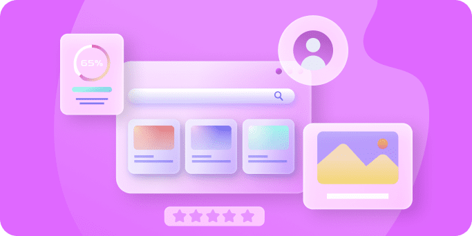
In 2025, mobile app UI/UX design isn’t just about looking good – it’s about delivering a modern, comfortable, and intuitive experience that users immediately connect with.
A well-crafted user interface (UI) and seamless user experience (UX) can make the difference between an app that users love and one they abandon.
In fact, research shows that every $1 invested in UX can yield around $100 in return – a staggering 9,900% ROI. With millions of mobile apps competing for attention, staying on top of design trends has become more critical than ever.
Companies like Google and Apple are evolving their design languages (e.g., Google’s Material You and Apple’s new “Liquid Glass” aesthetic in iOS 26) to push the envelope of personalization and visual delight.
Below, we explore the top UI/UX design trends in mobile apps for 2025 – trends that not only make apps look cutting-edge and appealing, but also ensure they are intuitive, engaging, and user-friendly for everyone.
1. Clean, Minimalist Aesthetics
“Less is more” remains a dominant principle in modern app design. Minimalist interfaces – featuring plenty of white space (or empty space), simple layouts, and only essential elements – help users focus on content without distraction. This “flat” design approach (popularized by earlier design languages and continued through Google’s Material Design and Material You) emphasizes clarity and quick comprehension. Studies have shown that users form an opinion about an app’s visual appeal in as little as 50 milliseconds, and simpler designs tend to be rated as more attractive and trustworthy at first glance. A prime example is Spotify’s mobile app, which uses a clean, unfussy layout and intuitive controls; Spotify’s minimalist approach clearly paid off, as the platform now serves hundreds of millions of users (over 365 million MAUs as of 2021).
Clean design isn’t just about looks – it has practical usability benefits. By stripping away superfluous graphics or buttons, minimalist apps reduce cognitive load on users. When an interface only presents the essential features or content, it’s easier for people to find what they need and take action without confusion. The result is often faster task completion and higher user satisfaction. For example, a banking app that shows your balance and a few primary actions on the home screen (and hides less-used options in secondary menus) lets you accomplish common tasks like checking balances or transferring funds in seconds. In contrast, a cluttered app makes you hunt through dense menus – an experience likely to frustrate users and drive them away.
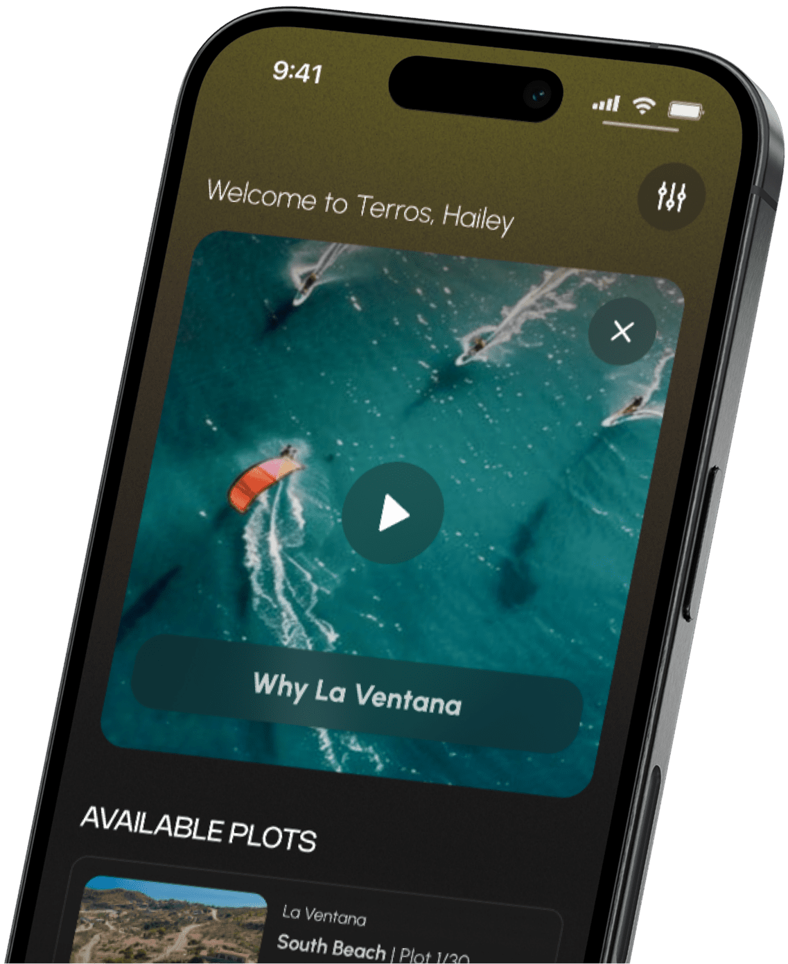
Modern minimalism does not mean boring or plain. Designers in 2025 are pairing minimalist layouts with bold accent colors, dynamic shadows, and subtle layers to create depth. One subtle visual trend is “glassmorphism,” which uses translucent, blurred panels (resembling frosted glass) to add dimension while maintaining simplicity. Apple’s latest design refresh with iOS 26 introduced a “Liquid Glass” material across the UI – a translucent, fluid effect that reflects surrounding content and brings greater focus to what matters. The interface still feels minimalist and familiar, but with a fresh sense of depth and polish. Similarly, Google’s Material You design (rolled out starting in Android 12) continues the flat design ethos but adds personalization and fluid motion. Material You dynamically adapts app color palettes to the user’s wallpaper, creating a personal yet minimalist look that’s consistent across the system. The takeaway: streamlined, clutter-free designs create a more pleasant experience and can even improve usability by making interfaces instantly understandable.
2. Dark Mode and Eye-Friendly Design
Dark mode UI of a mobile banking app example, illustrating how darker backgrounds and high-contrast elements can reduce glare and eye strain.
Over the past few years, dark mode has evolved from a niche preference to a must-have feature in app design. Dark themes replace bright backgrounds with dark hues (often black or deep gray), displaying light text instead of dark text. This inversion can reduce screen glare and eye strain, especially in low-light environments or at night. Users have enthusiastically embraced dark mode for both practical and aesthetic reasons. Health organizations note potential benefits for users’ eyes when using darker interfaces in dim conditions – reduced blue-light exposure and less contrast between screen and ambient darkness means less strain before bed. There’s also a practical bonus: on devices with OLED or AMOLED screens, dark interfaces can save battery life by lighting up fewer pixels (since black pixels are effectively off on these displays).
Major apps and platforms have reported positive engagement metrics after introducing dark mode options. When Twitter and Reddit added official dark themes, a significant portion of their user base switched over, especially during evening hours, leading to longer session times (since users found it more comfortable to browse at night). In general, offering a dark mode can keep users engaged for longer periods – one study found that giving users a dark interface option encouraged longer browsing sessions and improved overall engagement metrics. Users appreciate being able to tailor the viewing experience to their environment and personal preference. For example, reading or content apps often see users flipping to dark mode late at night to comfortably continue reading without straining their eyes.
Beyond dark mode, eye-friendly design in 2025 includes features like configurable text size, softer color schemes, and even “warm” color shifting. Both iOS and Android now have system-wide settings for light and dark modes, and apps are expected to follow suit automatically (respecting the user’s device setting). Many apps also offer an automatic switch: they’ll use light mode in daytime and shift to dark mode in the evening. This adaptive design demonstrates digital wellness by reducing bright-light exposure at night. Furthermore, designers are paying attention to contrast and readability in both modes. Simply inverting colors isn’t enough – the best dark mode designs tweak hues to ensure sufficient contrast (e.g., using off-white text instead of pure white on black, which can be glaring). Comfort is the goal. By embracing dark mode and other eye-friendly options, app creators show they care about users’ comfort and health. It’s gotten to the point that many users expect a dark theme; not providing one could even put an app at a competitive disadvantage.
3. Hyper-Personalized Experiences
One size doesn’t fit all in modern UX. Personalization has become integral to mobile app design, leveraging user data and AI to tailor content, layout, and features to each individual. Rather than every user seeing the same static interface, apps in 2025 often adjust what you see based on your behavior, preferences, location, or even the time of day. Studies indicate that roughly 80% of consumers are more likely to do business with a company if it offers personalized experiences – people appreciate apps that feel “made for me.” In practice, this can take many forms.
Content personalization is very common: for example, Netflix’s algorithms curate movie and show recommendations uniquely for each user, which has helped drive its viewer retention rate to an impressive 93%. (Netflix boasts a 93% customer retention, far outpacing competitors, largely due to its highly personalized content suggestions.) Similarly, Spotify creates custom weekly playlists (Discover Weekly, Release Radar) based on your listening habits, making the app experience feel uniquely yours. Beyond content, personalization can involve UI customization – some apps let users choose themes or rearrange sections of the interface to match their usage patterns. For instance, a news app might learn which topics you read most and then surface those categories at the top of the home screen. Or an e-commerce app might promote items related to your past purchases and browsing history.
Advancements in AI, especially large language models and machine learning, have supercharged what’s possible with personalization. Apps can now predict what a user might need next. A fitness app might adjust its home dashboard dynamically (“It’s nearly lunchtime; here’s a quick workout you can do”). A travel app could change its UI based on your trip stage – e.g., showing your boarding pass prominently when you’re at the airport. Personalization even extends to notifications: instead of generic pings, apps send tailored messages at optimal times (like a finance app reminding you about a bill that’s due, because it knows you have upcoming payday funds). All this makes users feel understood and catered to.
Crucially, personalized UX not only improves satisfaction but can also boost engagement and conversion rates. When users feel like an app “gets” them, they tend to use it more and stick around longer. According to McKinsey, over 70% of consumers now consider personalization a basic expectation of apps and digital services. Businesses benefit too – for example, personalized product recommendations can increase sales and in-app spend. By making users feel like the app experience is “just for them,” you foster loyalty. Of course, privacy is important to respect in this process; the best implementations of personalization are transparent and give users control (like letting them fine-tune content preferences or opt out of certain customizations). Done right, hyper-personalization is a win-win: users get more value with less effort, and apps see higher retention and revenue as a result.
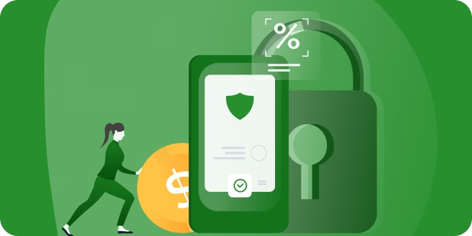
4. Passwordless, Seamless Login
Struggling to remember (or reset) passwords has long been a pain point in UX. In 2025, passwordless authentication is on the rise, transforming how users log in to apps and services. Instead of typing complex passwords – which are often forgotten, reused, or compromised – more apps are adopting secure alternatives like biometrics (fingerprint or face ID), one-time passcodes sent to your device, and “magic links” emailed or texted to the user. The goal is to make logging in frictionless and more secure at the same time.
This trend is driven by both security needs and user convenience. It’s estimated that 49% of security breaches in the past year were due to weak or stolen credentials – in fact, 86% of data breaches leveraged stolen or weak passwords. Traditional passwords are a weak link: users pick easily guessable passwords or repeat the same ones everywhere, and hackers exploit this. By contrast, passwordless methods can be inherently more secure (for example, a one-time code or a biometric scan can’t be phished as easily, and there’s no static password to steal). Tech giants have been championing this shift. Microsoft reported that more than 150 million people each month were signing in to its services without passwords by 2020 (using Windows Hello, authenticator apps, etc.) – a number that’s only grown since. And in late 2022/2023, Apple, Google, and Microsoft jointly backed passkeys, a new standard to replace passwords with cryptographic key pairs synced to your devices (passkeys allow you to log in with device biometrics and are phishing-resistant).
From a UX perspective, going passwordless makes the first-run experience and returning login far smoother. Think of a messaging app or banking app: instead of forcing you to create and remember yet another password, the app might allow account creation via phone number (send an SMS code to verify) or via an existing identity (like “Sign in with Apple/Google”) – or, after initial setup, simply rely on your device’s biometric unlock. Many apps now let you enable Face ID or Touch ID for login, meaning subsequent logins are just a quick glance or fingerprint press. Over 150 million people were already using such passwordless methods each month in recent years, and that number spans all kinds of apps – from social media and email to enterprise tools. Users appreciate the reduction in hassle: no more “forgot password” loops, and no need to type a long string on a tiny mobile keyboard. It also helps onboard new users who are often deterred by registration friction – if someone can start using your app by simply tapping “Log in with Email” and clicking a magic link, they’re more likely to convert than if they had to fill a big form and think of a password.
Security experts also note that passwordless means fewer breaches. With two-factor authentication (2FA) and biometric logins, it’s far harder for attackers to gain unauthorized access. For instance, an attacker might steal a password, but they can’t fake your face or fingerprint easily, and they probably don’t have your physical phone to get a one-time code. It’s estimated that eliminating passwords could remove the vector used in a huge share of attacks. Even corporate IT departments love this trend: it reduces the volume of password-reset support tickets and the risk of phishing.
Going passwordless in 2025 might involve:
- Biometric authentication: Using the device’s built-in fingerprint sensor or facial recognition (fast and user-friendly).
- One-tap logins: Magic links (click the link sent to your email/phone and you’re in) or one-time passcodes (6-digit codes) instead of fixed passwords.
- Single sign-on (SSO): Allowing login through accounts like Google, Apple, or Facebook, which means users don’t create a new password at all and can leverage an identity they trust.
- Passkeys: On supported platforms, users can create a passkey for your app, which lets them log in on any device through a secure device handshake (and usually a biometric confirm), completely removing the need to ever deal with a password.
All these methods make sign-in quicker and safer. For users, it’s a quality-of-life improvement – they can get into their accounts with a tap or glance, as opposed to typing and potentially getting errors. For app makers, it means higher retention (users aren’t dropping off because they got locked out of their account or got frustrated setting one up) and better security (which protects your brand reputation). As data breaches and privacy concerns remain high, expect more and more apps to embrace biometric and password-free logins to keep accounts safe while keeping users happy.
5. Augmented Reality (AR) Integration
Once a futuristic concept, augmented reality (AR) features are becoming mainstream in mobile apps. AR overlays digital content onto the real world through your phone’s camera, creating interactive experiences that blend physical and virtual elements. And it’s not just for gaming anymore – the global AR market is projected to reach tens of billions of dollars in revenue within the next few years, reflecting its rapid growth and widening use cases.
Apps across industries are using AR to create immersive, useful experiences. A standout example is IKEA’s furniture app, IKEA Place, which allows users to superimpose true-to-scale 3D furniture models into their living room before buying. You can point your phone at an empty corner of your room and see, say, a virtual couch or chair “placed” there through the camera – move around it, see it from different angles, and decide if it fits your space and style. This try-before-you-buy AR experience has been revolutionary for furniture shopping, eliminating guesswork and buyer’s regret.
The IKEA Place app allows users to preview virtual furniture (like that red armchair) in their real space via the smartphone camera, making shopping interactive and fun.
Another well-known AR success is Pokémon GO, which showed the entertainment potential of AR on a massive scale. The game overlays virtual creatures on real-world locations, so you see Pokémon appearing in your backyard or at the park through your camera. This concept of getting people to explore real locations for virtual rewards was wildly successful – Pokémon GO surpassed 1 billion downloads globally and proved that AR can engage mainstream audiences. Following Pokémon GO, we’ve seen AR games like Harry Potter: Wizards Unite and others try similar approaches, and many social apps incorporate AR filters (Snapchat and Instagram face filters, for instance, which are a form of AR that adds fun effects to your face or surroundings).
In 2025, AR capabilities in phones (and tablets) are far more advanced than a few years ago. Newer devices have depth sensors and LiDAR, allowing for more accurate placement of AR objects and better environment mapping. This enables a range of applications:
- Shopping and preview: Furniture and home goods (IKEA Place), makeup try-on (apps that let you see lipstick or glasses on your face), even car showrooms (seeing a virtual car in your driveway).
- Education and information: AR apps that, for example, let medical students visualize human anatomy on a real body, or tourists point their phone at a landmark to see historical info pop up. Google Maps now has an AR mode for walking directions – hold up your phone and AR arrows appear on the street view to guide you.
- Design and planning: See if a painting fits on your wall. Plan a garden by viewing virtual plants in your yard. Interior design apps use AR to let you virtually paint walls or arrange decor.
- Interactive entertainment: AR scavenger hunts, interactive children’s stories that play out in your living room, or AR concerts where performers appear as holograms in your space.
With Apple’s introduction of Vision Pro (an AR/VR headset) and ongoing ARKit improvements, and Google’s ARCore on Android, the toolkit for developers is robust. As a result, we’ll see more apps leveraging AR for practical convenience and engaging visuals. The key from a UX standpoint is making AR features intuitive – guiding users to move the camera around, establishing tracking, and ensuring the AR content adds value (and isn’t just a gimmick). When done right, AR-enhanced UIs offer users a uniquely engaging experience that can set an app apart from the competition. Expect AR to continue creeping into productivity apps (e.g., AR measuring tools, AR translation of signs in real time) and collaborative apps (seeing 3D models in AR during a video call meeting), not to mention continued growth in retail.
In short, augmented reality is moving from novelty to utility. The cameras on our phones aren’t just for taking photos – they are becoming lenses through which we can do and see more. Apps that harness this capability can delight users and deliver information in innovative ways. As AR hardware and software evolve, designers will incorporate cues (like on-screen prompts, 3D anchors, etc.) to make these experiences smooth. We’ve reached a point where blending digital with physical is a viable design strategy, and the result is richer, more immersive app experiences.
Get Your Free 45-Minute App Roadmap
Meet 1-on-1 with our senior product team. We’ll map your MVP or enterprise app and hand you a personalized plan—clear scope, a realistic timeline, and fixed monthly costs—for iOS & Android, web, tablets & wearables, and AI.
6. Custom Illustrations and Visual Flair
Generic stock photos are out; custom illustrations and graphics are in. Many modern apps are incorporating unique, often playful, illustrative art in their interfaces – from quirky iconography to full-scene illustrations on onboarding screens or empty states. These bespoke visuals serve to express a brand’s personality and make the experience more memorable and fun for users.
Unlike stock imagery, illustrations can be tailored exactly to an app’s style and messaging. They can be whimsical, serious, futuristic, or minimalistic – whatever suits the brand. The result is a distinctive visual identity that users will remember and associate with the app.
A great example is Dropbox, which famously used hand-drawn, doodle-like illustrations throughout its early design (e.g., a drawing of a cardboard box with stuff popping out, or playful scenes to represent concepts in the app). This gave Dropbox a friendly, approachable vibe – as the Dropbox team noted, the personal, hand-drawn style helped users feel like Dropbox was human and creative, not just another boring cloud utility. It set the brand apart and contributed to Dropbox’s widespread appeal in its early years. Many other tech companies followed suit once Dropbox proved that illustrations can define a brand; we saw Slack use custom emoji-style art and welcome screens, Mailchimp is known for its humorous mascot drawings, and Uber at one point commissioned cityscape illustrations for each city launch.
Research suggests that personalized, context-relevant visuals can boost user engagement and even understanding of content. Humans are visual creatures – a well-crafted illustration can convey meaning or emotion faster than a paragraph of text. For instance, if an e-commerce app has an empty cart, showing a cute illustration of a sad shopping bag can immediately communicate “your cart is empty” in a more charming way than just words. Users often feel more delighted and less frustrated when they encounter these little pieces of art in the UI. In onboarding flows, a series of illustrations can walk users through what the app does in a friendly manner, making the first-time experience more enjoyable and reducing drop-off.
In 2025, we expect to see more apps using bespoke illustrations, animations, and even custom emoji or icon sets to reinforce their branding. Vibrant illustrations can be used for:
- Onboarding/tutorial screens: For example, a finance app might show a cheerful drawing of people saving money to illustrate “Get your finances in order.”
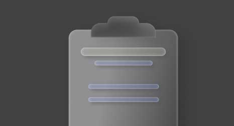
- Empty states and error states: Rather than a plain message like “No data yet,” an app might show a small illustration (like a clipboard or an inbox with flying paper) to make the empty state feel designed and intentional.
- Mascots or characters: Some apps develop a character (like Duolingo’s famous green owl) and use it in illustrations to encourage or reward the user.
- Unique icons and micro-animations: Instead of using standard icon sets, apps might commission iconography that matches their illustration style. When tapped, these could have subtle animations.
The visual flair extends beyond static images. Designers are also using motion graphics to bring illustrations to life – such as subtle parallax movements, animated transitions where an illustration might slide in, or a character might wave. All of this creates a sense of polish and delight. Importantly, these custom visuals support the content rather than distract from it. Good illustrations in UI have purpose: they clarify, guide the eye, and evoke brand emotion.
From a branding perspective, investing in custom art can yield a strong ROI. Users come to recognize the style and associate it with quality. In an age of template-based design, doing something custom and creative visually can be a differentiator. Of course, illustrations should be optimized (so they don’t slow down the app) and inclusive (avoid overly abstract art that might confuse international audiences, for example). Done thoughtfully, visual flair in the form of custom illustrations can greatly enhance UX and improve retention and word-of-mouth.
7. Bold and Distinct Typography
Typography isn’t just for decoration – using bold, eye-catching fonts has become a powerful design trend to improve both usability and brand recognition. Apps in 2025 are more deliberate than ever about their typefaces. We’re seeing big, expressive text in mobile UIs: large headlines, custom font choices, and striking text layouts that make an instant impression and also enhance readability on small screens.
A well-chosen typeface can serve multiple purposes:
- Improve readability: As phone screens have higher resolution and varying sizes, designers can afford to use more interesting fonts while still maintaining clarity. Big, high-contrast text (think a large section title or a numeric stat in a health app) can actually make an interface easier to skim. A strong typographic hierarchy (with clear, bold headings and legible body text) guides users’ eyes to what’s important. It’s intuitively true that text that stands out properly tends to get more interaction (for example, a big bold “Start Now” label on a button will attract more taps than a weakly styled one).
- Establish brand personality: Typography is a huge part of visual identity. Many companies now commission custom fonts or choose distinctive font families to use across their product. By using typography consistently, users begin to recognize the brand even from a screenshot. Bold typography can evoke emotion – a playful rounded font might feel approachable; a thin, elegant font might feel premium; a monospace or chunky serif might feel quirky or nostalgic.
- Enhance aesthetics: Minimalistic interfaces often rely on text as a primary element. Many app designs feature a lot of whitespace and then a few bold words or numbers that create the visual dynamic.
Specific typography trends include variable fonts and responsive text. Variable font technology allows a single font file to smoothly adjust weight, width, or slant. Designers use this to create responsive typography that can scale elegantly between device sizes or even adjust on the fly (for instance, making a font slightly heavier on a small display for readability). Apps are also embracing font pairing – using one font for headlines and another complementary font for body text to create contrast and interest. We also see more uppercase, letter-spaced headings in some apps for a modern feel, and occasionally unconventional placements (like rotated text or vertical text for decorative effect, sparingly in creative apps).
Moreover, bold doesn’t always mean thick – it means typographically bold, which could be a striking custom type, a big size, or an unusual color for text. Many companies refreshed their mobile apps recently with more distinct typography. Clear text hierarchy and the use of familiar font styles improve user comprehension of content, which is one reason Material Design 3 put emphasis on dynamic, easy-to-read type scales.
Memorability is another benefit. Users might not consciously note “oh, nice font,” but subconsciously the unique type helps imprint the app’s look in their mind. If someone sees a screenshot of your app, your typography can make it recognizable at a glance.
One caveat: while creativity in fonts is encouraged, accessibility must remain top priority. Even when using distinct fonts, ensure contrast is sufficient (per WCAG guidelines) and that important text is easily readable. Many apps support dynamic type (on iOS) or font scaling for users who need larger text. The good news is, an emphasis on typography often goes hand in hand with improved accessibility.
In summary, bold typography is both a design statement and a functional improvement. By making text not only legible but visually engaging, apps keep users’ attention and communicate effectively.
8. Inclusive, Accessible Design
Designing for accessibility is no longer optional – it’s a mainstream trend and an ethical imperative. With over 1 billion people worldwide living with some form of disability, apps that cater to diverse needs can reach a much wider audience and provide a better experience for all users. In 2025, successful apps are expected to bake in accessibility from the start, rather than treating it as an afterthought.
This includes building in features and following practices such as:
- Voice controls and screen reader compatibility: Apps should work with screen readers like VoiceOver (iOS) and TalkBack (Android) so that visually impaired users can have content read aloud and navigate via spoken feedback. Use proper semantic UI elements and labels on controls.
- Adjustable text sizes and scalable layouts: Users with low vision or reading difficulties often increase system font sizes. Respect that and ensure the layout adapts (no clipping). Providing easy ways to toggle larger text or high-contrast mode is a plus.
- High-contrast and color-blind-friendly design: Approximately 1 in 12 men (and 1 in 200 women) have some form of color blindness. Use color combinations that remain distinguishable without relying solely on hue, and ensure sufficient contrast between text and background. Some apps provide a special high-contrast theme.
- Captions and alternative text: If your app has video or audio content, include captions or transcripts. Images should have descriptive alt text so screen readers can describe them.
Beyond these specifics, inclusive design acknowledges a broad spectrum of human abilities and contexts – not just permanent disabilities, but also temporary and situational constraints. Apps that plan for these scenarios create better UX for everyone. There’s also a strong business case: designing with accessibility in mind can increase an app’s potential market reach by up to 15%. Many accessibility features coincide with general usability improvements (e.g., dark mode or voice input).
App stores and governments are increasingly pushing accessibility. In some regions, digital services must meet certain accessibility standards, and there have been high-profile lawsuits when apps or sites aren’t accessible, which puts pressure on businesses to prioritize this.
Setting that aside, the moral impetus is compelling. Ensuring your app can be used by someone who is blind, or has limited dexterity, or cognitive differences, means not excluding people from the digital world.
Ultimately, accessibility is about making sure no user is left behind, regardless of ability or context of use. When you design for extremes, you often create a superior product for the middle as well. In 2025, accessibility is considered a core aspect of UX quality – akin to performance or security.
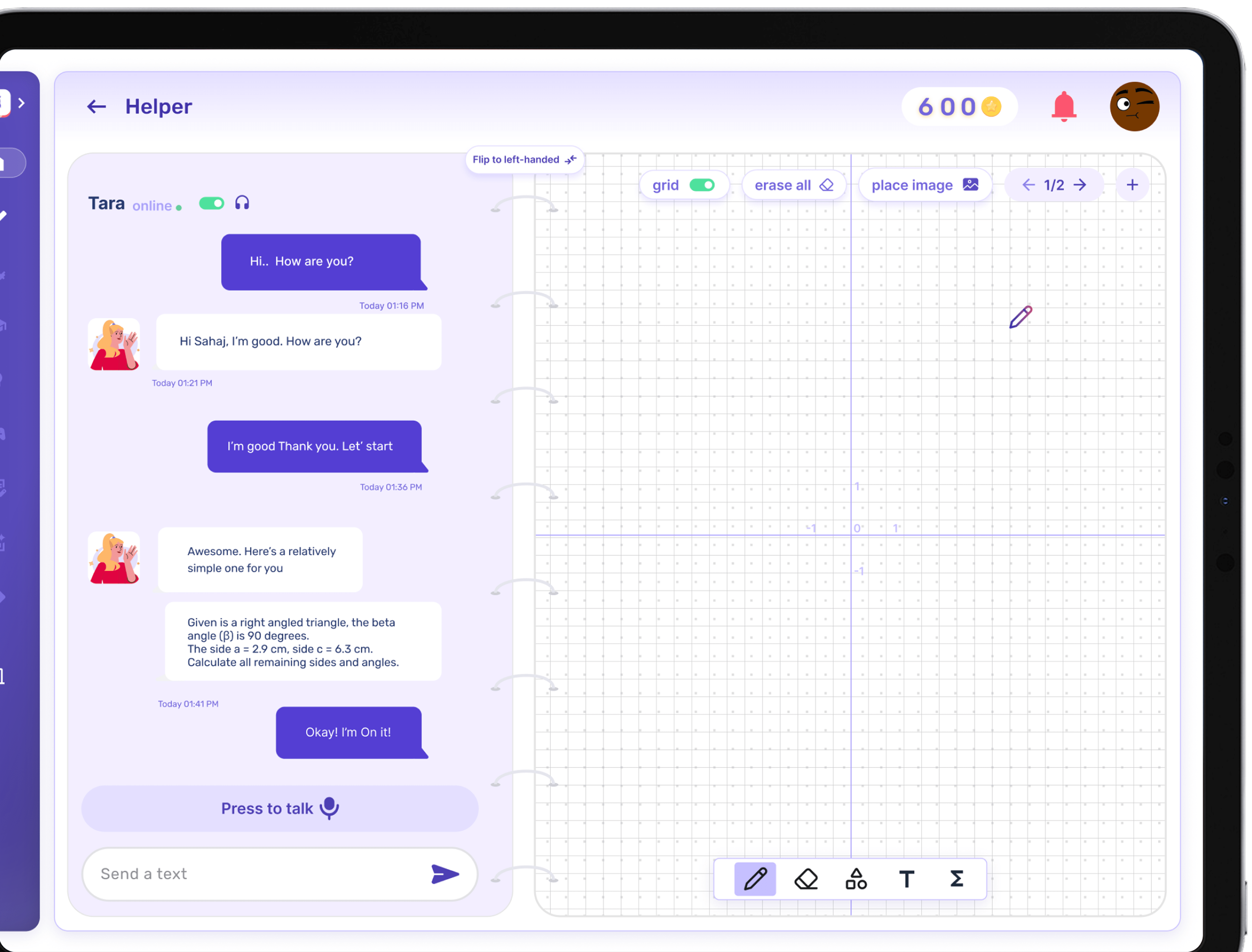
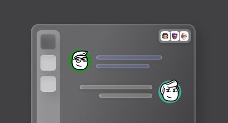
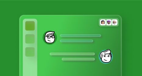
9. Conversational UI and Voice Interaction
The rise of AI assistants and chatbots has led to a surge in conversational user interfaces in mobile apps. Instead of relying solely on tapping buttons and navigating menus, users in 2025 can interact with apps through natural language – typing or even speaking requests and commands. This shift is powered by advancements in natural language processing (NLP) and the ubiquity of voice assistant technology (like Siri, Google Assistant, Alexa), as well as sophisticated chatbots (often backed by powerful language models).
What does a conversational UI look like in a mobile app? It can manifest in a few ways:
- Chatbots within apps: Many services integrate a chat-style interface where users can ask questions or give instructions in plain language (e.g., “What’s my account balance?”).
- Voice-activated features: Some apps incorporate voice directly for search or commands (e.g., “Add an entry for tomorrow at 3 PM” in a notes app).
- Full conversational experiences: Apps where the primary interface is messaging an assistant (e.g., therapy chatbots, language-learning conversations, AI shopping assistants).
Users appreciate the speed and personal touch these conversational elements provide. A recent survey found that 70% of consumers prefer interacting with voice or chat assistants for quick answers to simple questions. Conversational UIs can also make complex tasks simpler by guiding the user step by step in a dialog format (e.g., filing an insurance claim via Q&A).
Real-world implementations include Starbucks’ “My Barista,” where you can order coffee by voice or text (“Order my usual morning coffee”). Ride-sharing apps have experimented with voice ordering or integrating with voice assistants (“Get me a ride to the airport”). E-commerce apps increasingly feature AI shopping assistants (“I need a gift for my 5-year-old niece”).
Under the hood, these systems are often powered by advanced AI. In 2025, the integration of direct AI services into apps is a big trend, enabling fluent, context-aware dialogue. Apps also leverage voice tech for accessibility and convenience (voice dictation, voice search). To implement conversational UI well, provide clear feedback and error recovery. The conversation should feel contextual, and privacy should be respected with transparency and opt-outs.
In conclusion, conversational UI and voice interaction are making mobile experiences more natural. We’re moving toward an era where you can just tell your app what you want, and it gets it done.
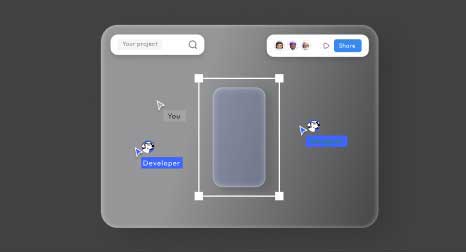
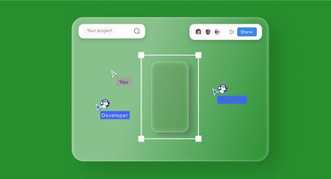
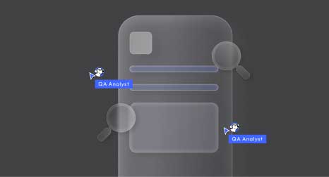
10. Seamless Navigation and Responsive Layouts
Users today expect mobile apps to be easy to navigate and to work flawlessly on any device or screen size. As smartphones have grown larger (and new form factors like foldable phones and tablets become more common), app navigation patterns have adapted to remain seamless and intuitive. One major design trend addressing this is the use of bottom navigation bars and other thumb-friendly design choices, ensuring that key actions are within comfortable reach of the user’s thumb on large screens.
On modern phones, the top of the screen is literally a stretch (especially on 6.5-inch-plus displays). Placing primary menus or common action buttons at the top can make one-handed use difficult – users either have to shuffle their hand or use their other hand. To solve this, designers have embraced bottom navigation bars (also known as tab bars on iOS). These are the row of icons/labels at the bottom of the app (typically three to five options) that provide quick access to the main sections. Apps that switched from a top hamburger menu to a bottom tab bar saw significant improvements in engagement and speed. Users could more quickly find and switch between sections. Another usability finding indicated that navigation was about 20–30% faster for users when using a bottom bar versus a traditional top menu. The reason is simple: bottom nav puts the hit targets in the natural thumb zone (the lower middle area of the screen where your thumb can reach comfortably) instead of the hard-to-reach zone at the top.
Heat map of thumb reach on a smartphone: green areas are easiest to reach (natural zone), yellow areas require stretching, and red areas are hard to reach. Modern app navigation places important controls in the green zone.
Popular apps like Instagram, Twitter, Facebook, and Spotify have long used bottom tab bars for their main sections (Home, Search, Profile, etc.), which keeps navigation one-tap and always accessible. Even apps that historically used hamburger menus (the “three lines” icon that opens a side drawer) are moving away from that when possible, because studies showed many users don’t discover features tucked in hamburgers and it’s slower (two taps to get to a section vs. one tap on a visible tab). The hamburger menu isn’t dead – it’s still used for secondary or overflow options – but primary navigation is often better served as a persistent bar or as easily accessible controls.
Beyond menu placement, gesture-based navigation has also grown. Swiping gestures (like swipe from left edge to go back, or pull up a bottom sheet) have become intuitive for many users, thanks to OS conventions. Apps leverage these to reduce on-screen button clutter and to create fluid navigation. “Seamless navigation” also implies that moving through the app feels frictionless and logical: clear labels, logical groupings of features, and always giving the user a sense of where they are. Redundancy in navigation can be user-friendly – different people have different habits – so offering multiple pathways (tabs, floating action buttons, gestures) helps.
Now, the second part: responsive layouts. Users might use an app on a small 4.7-inch older iPhone SE or on a large 7-inch Android phablet or a tablet – or even on a desktop via a web version. Responsive design principles ensure the app’s UI adapts to whatever screen real estate is available, providing an optimal experience. In mobile apps, this is seen in adaptive UI components. For instance, on a phone, two-column content may collapse to one column stacked vertically; on a tablet, the app might show a sidebar navigation always open (since there’s space), whereas on a phone that same sidebar might be hidden behind a menu button.
With foldable devices coming into play (phones that open into small tablets), an app might reflow on the fly from a narrow portrait layout to a wide almost-square layout. You start an app on the small screen, then unfold to big and the app seamlessly rearranges content to utilize the larger canvas. Android and iOS both offer robust layout frameworks (e.g., constraint-based layouts, SwiftUI’s adaptive stacks) to help developers create these flexible interfaces.
Why is responsiveness key to UX? Because it eliminates pinch-and-zoom, rotation weirdness, or wasted space issues. Embracing responsive design across devices can increase cross-platform user engagement because users have a consistently good experience whether they’re on a phone or tablet. Especially for productivity or content apps, many people expect to use a phone on the go and a tablet at home – the app should feel native in both contexts.
Responsive design also covers orientation changes. A good app in 2025 supports both portrait and landscape (particularly important for video apps, games, any media). The layout might adjust – in landscape, a video player might go full screen with controls; in portrait, you might see comments underneath the video. It’s all about using the available space wisely.
We also have to mention platform conventions: iOS vs. Android navigation differences. While both platforms have converged in many aspects (both have bottom-nav patterns and full-screen swipe gestures), there are still distinctions designers account for to meet user expectations on each device type. In addition, continuity and integration are part of “seamless” UX: users might start a task on mobile and continue on another device. Cloud sync and handoff features help the journey feel smooth.
To encapsulate: intuitive navigation plus responsive design make apps feel modern and user-centric. Designers in 2025 achieve this by adopting flexible grid layouts, relative sizing, and extensive testing on various devices. The payoff is huge: users get a consistent, frustration-free experience no matter how or where they use your app. That consistency builds trust and habit.
Conclusion
Staying up to date with UI/UX design trends isn’t about chasing fads or adding flashy visuals for their own sake – it’s about meeting user expectations in an evolving digital landscape and leveraging new techniques to create better experiences.
The overarching theme for 2025 is user-centric design. From personalization to accessibility to conversational interfaces, the top trends all focus on making apps more intuitive, engaging, and tailored to users’ needs and contexts. Modern mobile apps strive to feel like they were designed just for the user – easy on the eyes, easy to navigate, and even proactive in helping the user achieve their goals.
Implementing these trends can dramatically improve how your app feels. A streamlined, minimalist interface (Trend 1) makes a great first impression and lowers the learning curve. Options like dark mode (Trend 2) and accessible design (Trend 8) show users you care about their comfort and inclusion, which builds goodwill. Personalization (Trend 3) and conversational UIs (Trend 9) make your app delightful and efficient to use, increasing engagement. Meanwhile, ensuring your navigation is thumb-friendly and layouts adapt to any device (Trend 10) removes barriers that might otherwise frustrate users.
These trends also complement each other. Designing for voice interactions (Trend 9) means thinking about accessibility (Trend 8). Bold typography (Trend 7) pairs well with minimalist design (Trend 1). As you iterate on your app’s design, you don’t need to adopt every trend blindly; consider which ones solve problems for your users and enhance your app’s purpose. Even subtle changes like a bottom navigation bar or a set of custom illustrations can have a big impact on user satisfaction.
In a world where users have no shortage of alternatives, designing your app with the latest UX best practices in mind can be a true competitive advantage. An app that feels modern and polished will inherently foster trust and loyalty. On the flip side, an outdated or clunky design can signal that the product is not keeping up.
Finally, remember that UI/UX design is an ongoing process. Trends evolve, but the constant should be listening to users and observing how technology is changing user behavior. By keeping the user at the heart of the process – and thoughtfully integrating trends like those discussed – you’ll be well on your way to building an app that delights users and delivers results in 2025 and beyond.
Need help implementing a cutting-edge app design? With deep expertise in modern UI/UX and a finger on the pulse of industry trends, our team can turn these best practices into a beautiful, intuitive app for your business. We’ve helped clients embrace everything from responsive layouts to AI-driven chat features.
Contact us for a free consultation – and let’s create an app experience your users will love in 2025 and beyond.